The final step in our exotic environment composition will be to create some values in our background with water-soluable colored pencil.
| KELL HIGH SCHOOL ART |
|
|
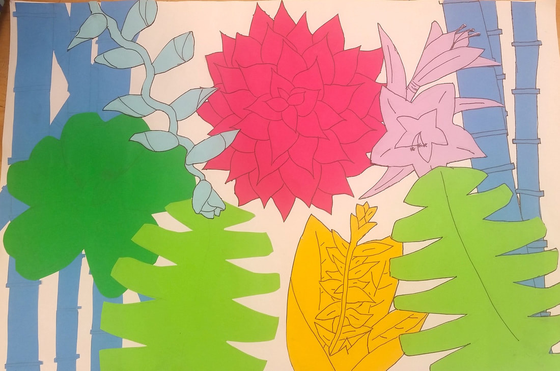
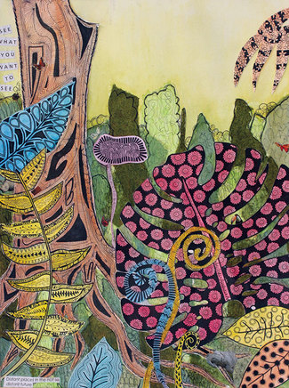
The final step in our exotic environment composition will be to create some values in our background with water-soluable colored pencil. Once students have drawn out all of their contours on the colored paper, they will cut them out and lay them out on the paper in order to create the best composition. Students should be sure to have overlapping plant shapes with very little negative space. They are able to hang off the edge of the paper if needed. 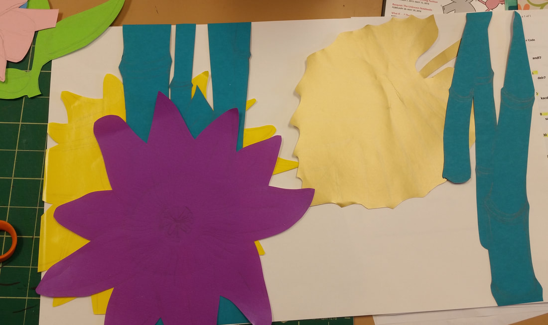 Keep arranging until you get the perfect composition! 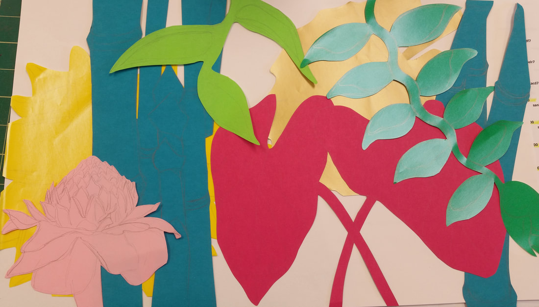 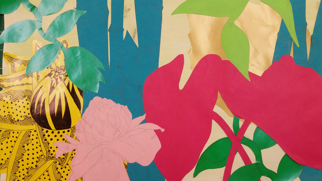
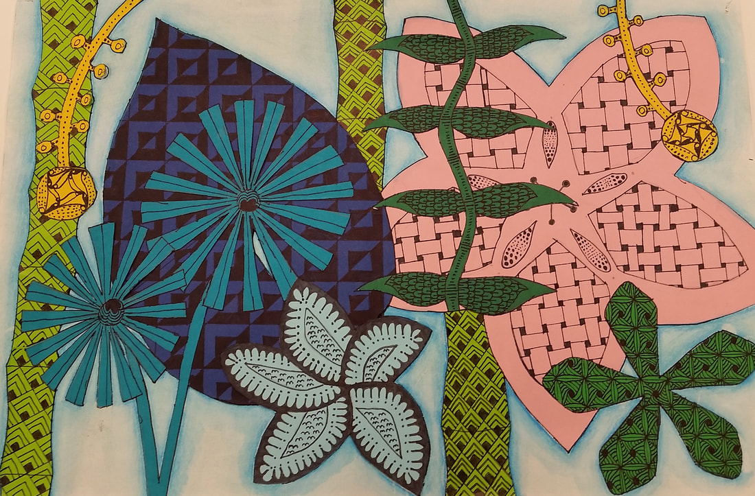
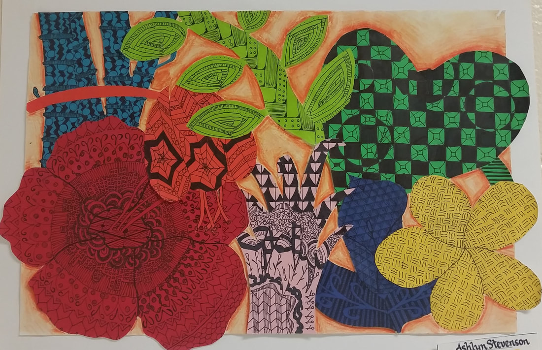
Once students have laid out their composition and glued it down, they should go over the contours with fine tip sharpie before adding the zentangle designs. That way, the design doesn't get confused with the contour lines.
Once students have their plants glued down and their contours drawn out, they will then create various Zentangle-Inspired designs within each plant.
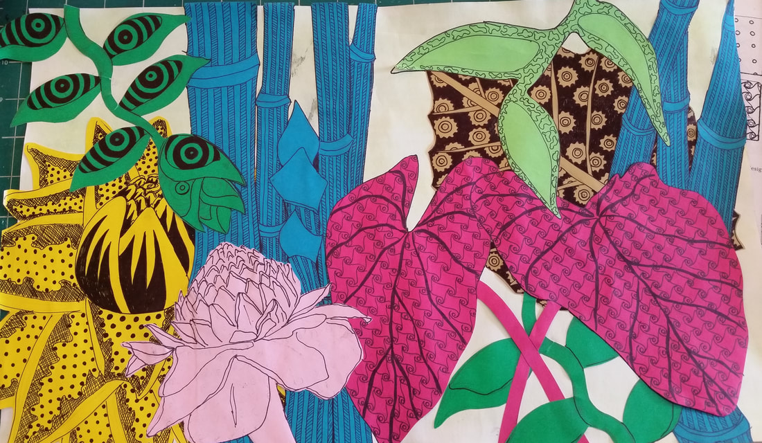
Below are some examples of Zentangle designs that you can create using the step-by-step guides:
The next step of your project will be to pick the 5 best images from your drawings that you did last week. Use these to draw LARGE on each of the 5 sheets of paper. If you don't draw large enough, then you will not have enough paper to cover the negative space. Good compositions have good overlapping, not too much negative space, but not too crowded either. They have large sized plants put on in an interesting way. Be sure to arrange your composition carefully before gluing it down! Test yourself: Which of the selected student images below have the stronger compositions? 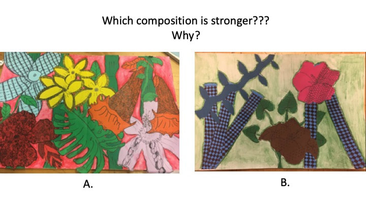 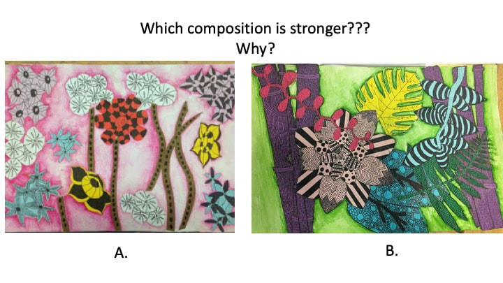 Agenda for today:
1.. Exotic Environments: watch the video below to learn about the next project and where to find the project rubric.
2. Then, search for tropical plants OR coral reef imagery using your laptop and draw 8-10 contour drawings in your sketchbook.
3. At take a photo of what you have done in your sketchbook today and send it to me using Remind. Exotic Environments:
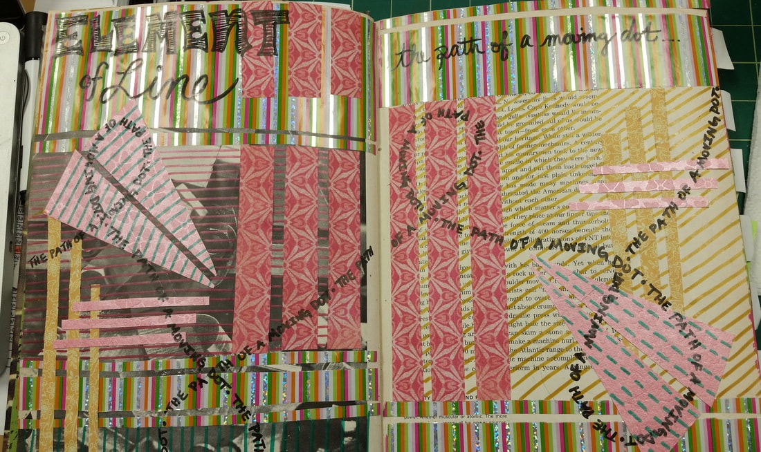
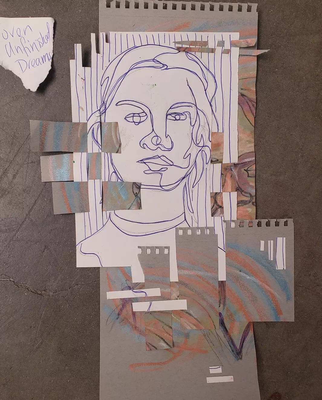
Today we begin our first altered book 2-page spread on the element of LINE. Students will create a linear collage with fancy/textured papers. They then will add line design with colored sharpies and complete the page with the title: LINE and its definition. Students who were not able to complete the assignment in class today can take it home, come in to work in the mornings, or complete it as an early finisher when they finish projects early in class.
Please be sure to review the supply list and syllabus. There is a syllabus sign off form at the bottom of this post! Please be sure to email me if you ever have any questions [email protected] .
You can also follow me and Kell High School Art on twitter @denison_julie . Supplies needed for VA Comp:
REQUIRED SUPPLIES
Bring in a $5.00 lab fee donation and all of the above supplies will be provided for you!!!! ***Also, we need old book donations to turn into art! They need to be hardback books with at least 60 pages. Any that you have would be appreciated. Additional RECOMMENDED (not required) SUPPLIES If you would like to have your own set of some of the supplies we will use in class, we recommend:
Class Syllabus:
Be sure to read the syllabus by downloading the file above. Read carefully, and sign off that you have done so on the form below, or click on the link here to sign off.
Join NAHS!!
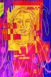
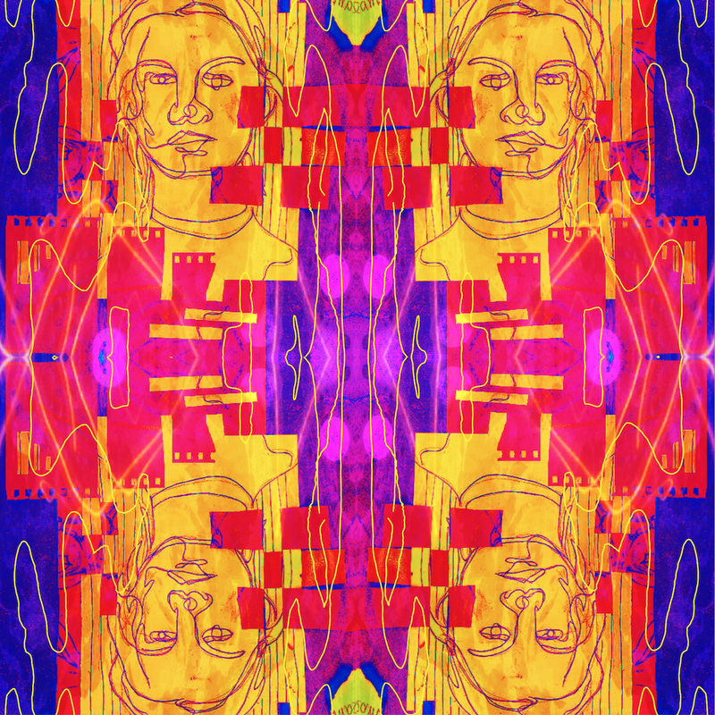
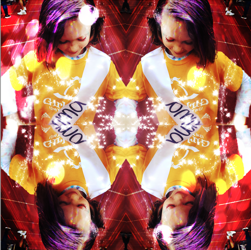
Download the Pixlr app to your device to create amazing edits to your photographs or previously made artwork! Check out the video below for directions on how to play with your images using the app. Be sure to post all of your images to your website!
Image #1: edit a photo of one of your artworks that you have done in class Image #2: edit a selfie/ or a photo of a friend or family member you have taken.
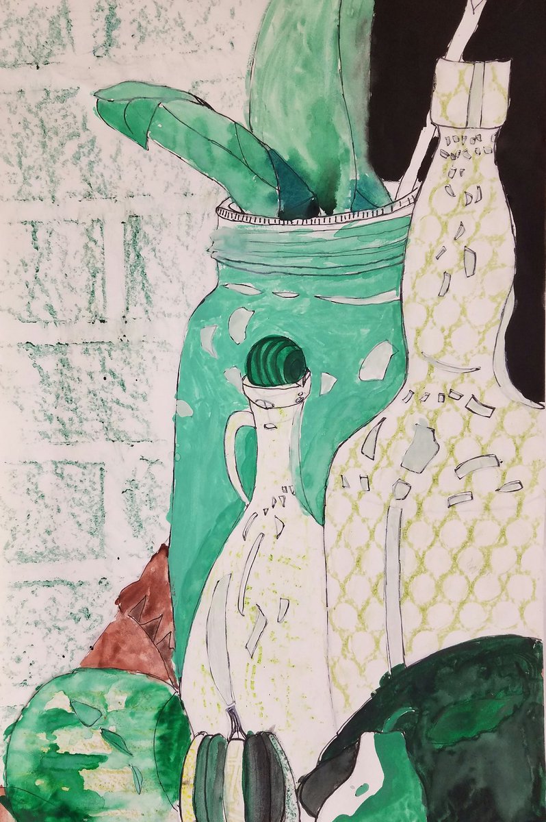
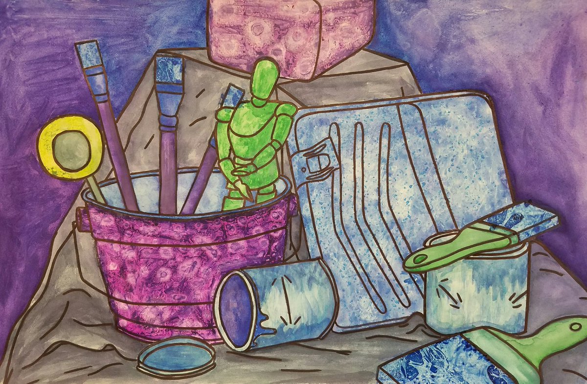
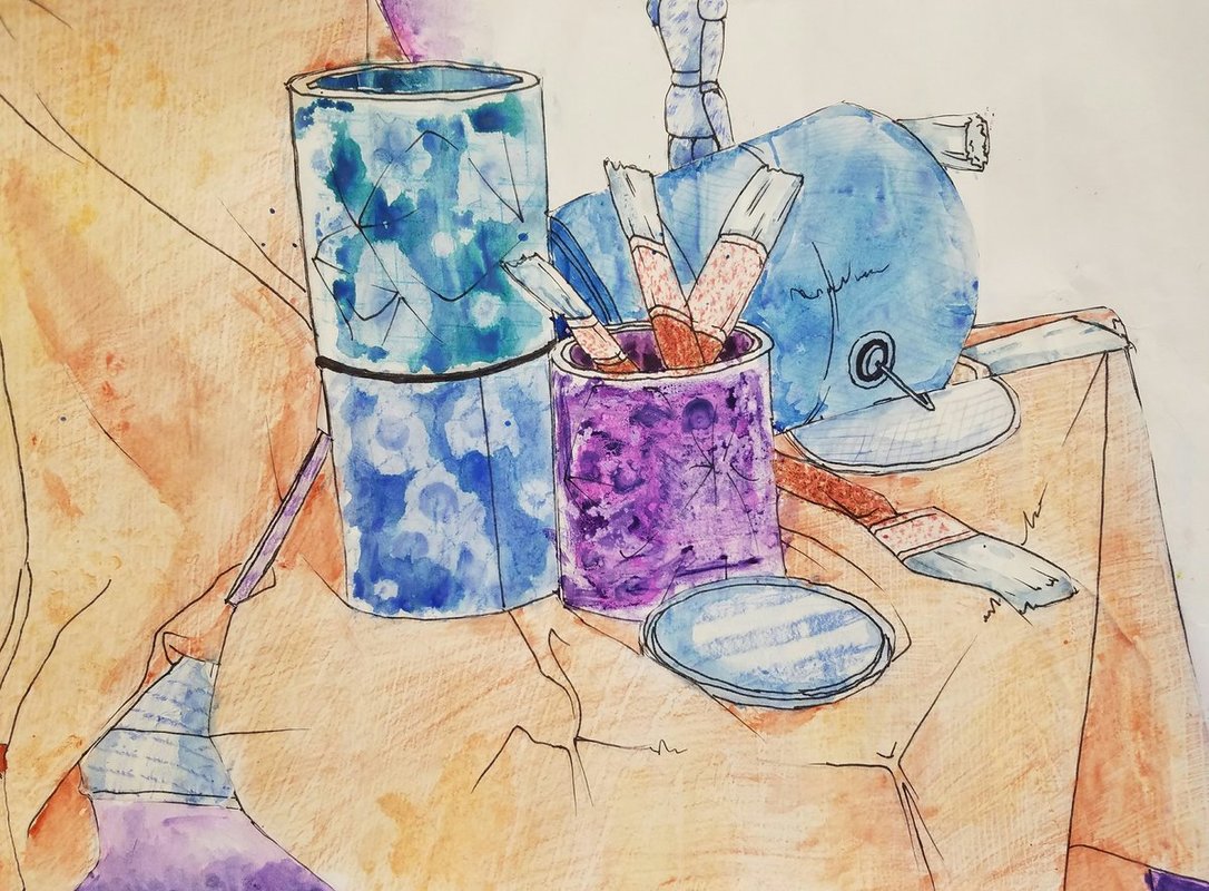
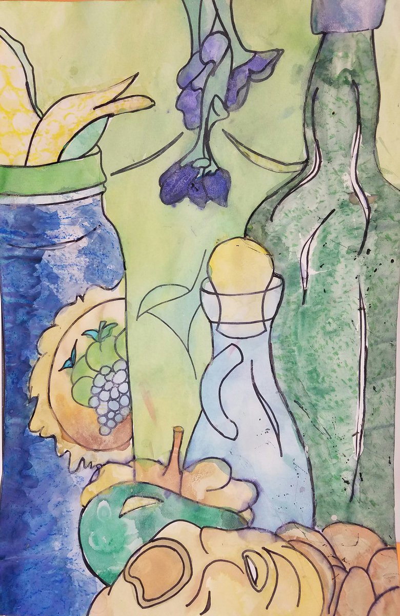
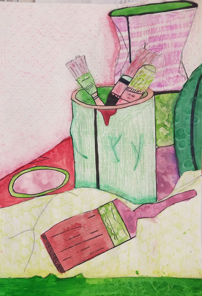
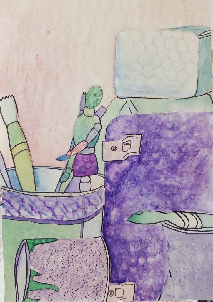
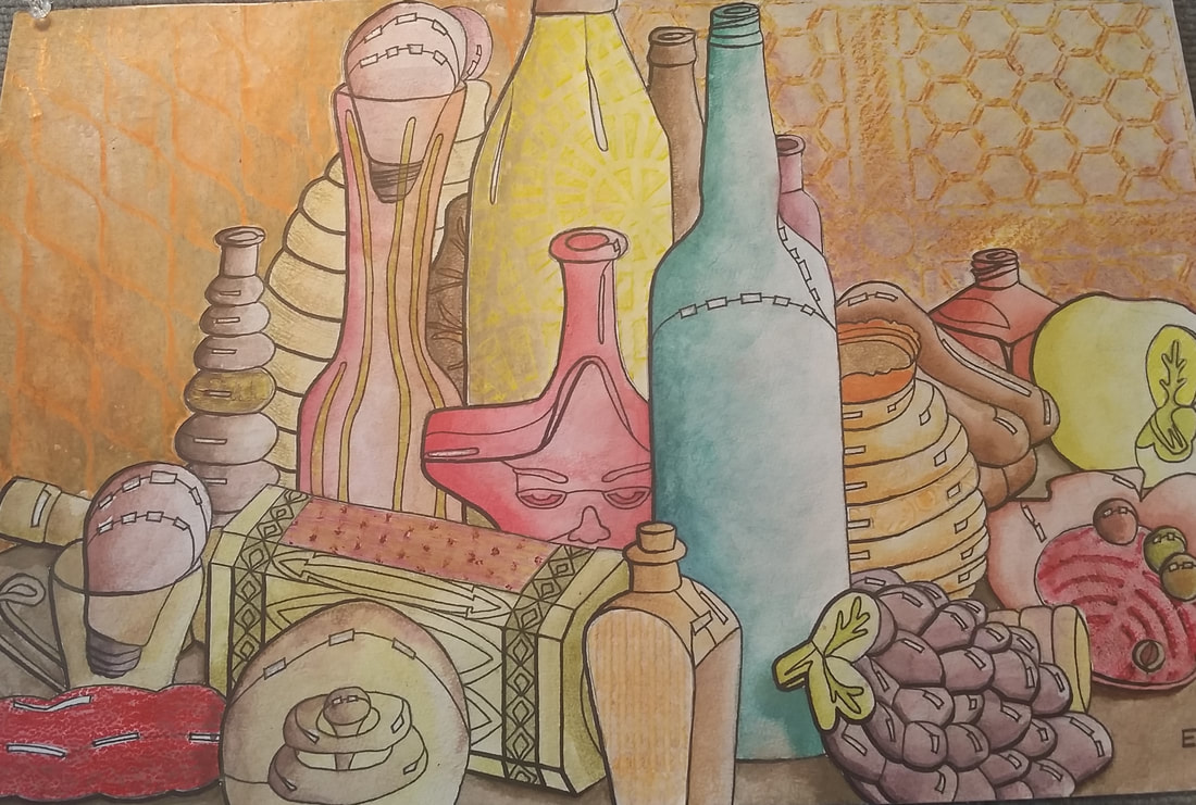
Don't forget that you need to pick a color scheme for your texture watercolor still life. You can pick from any of the following color schemes:
Be sure to have a color pow-wow with Mrs. Denison to be sure you have a good color scheme choice. (below are examples of some of the color scheme choices) Don't forget to include the following:
 Also, one thing that may help you is to take a photo of the area in your view finder. Then put a black and white filter on it and it will help you see values better. This way, when you add values with watercolor, you know where the darks and the lights will go.
|
fun SitesMarilyn Maker
Silk- Interactive Art Tessellate Jackson Pollock (splatter painter) Build Your Wild Self Mondrimat Mr. Picassohead Mandala Maker Art Games Bomomo Art Pad The Color Test Getty Games Archives
April 2024
Categories
All
|
||||||||||||||||


 RSS Feed
