acrylic_or_oil_pastel_still_life.docx |
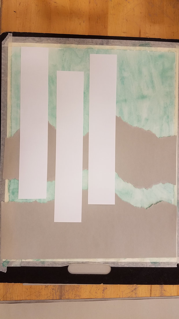
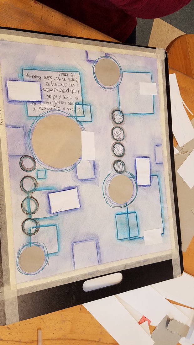
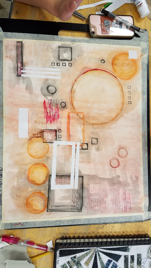
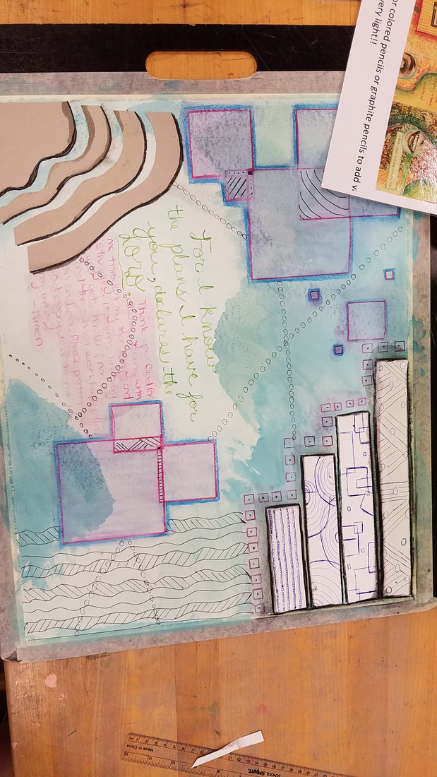
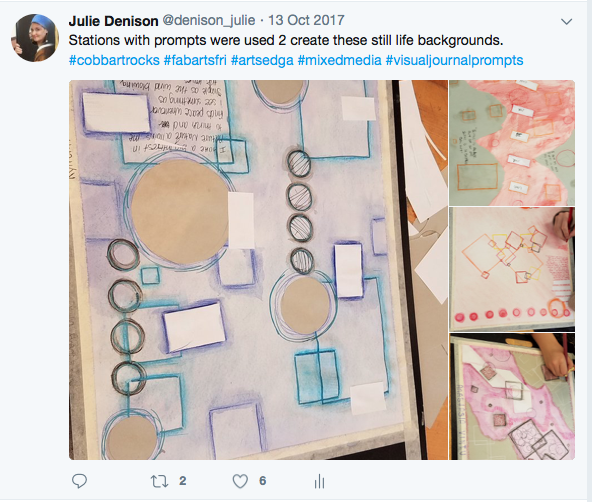
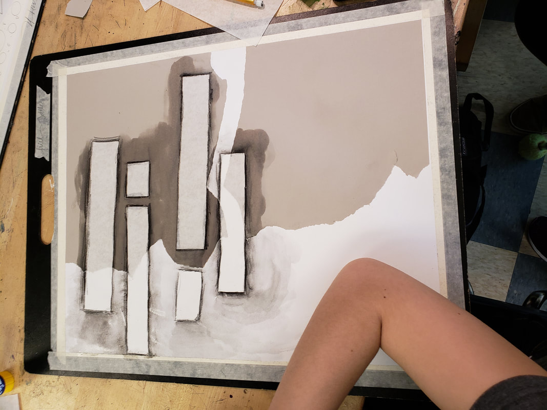
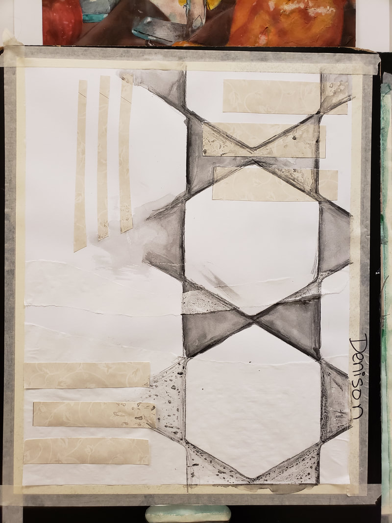
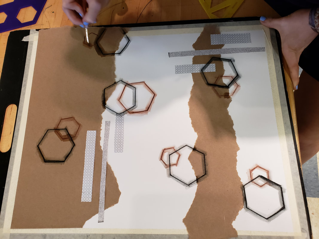
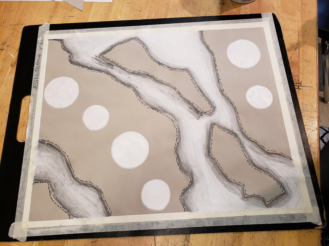
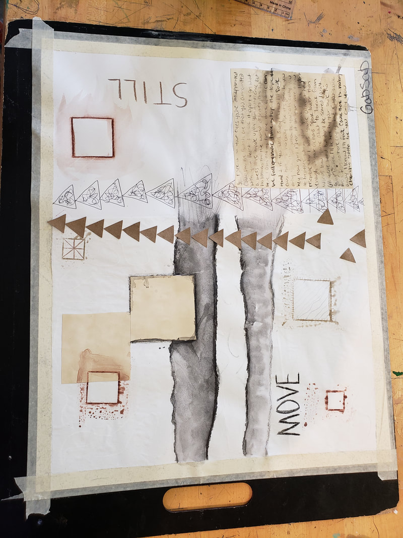
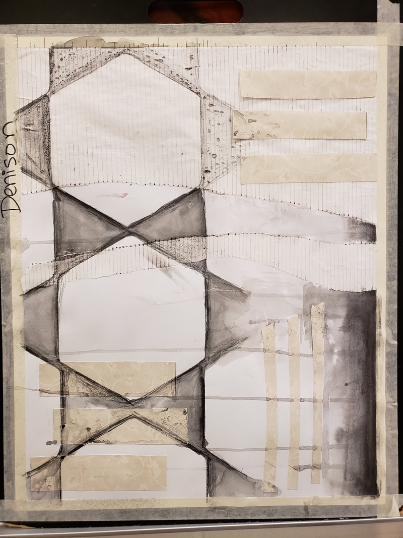
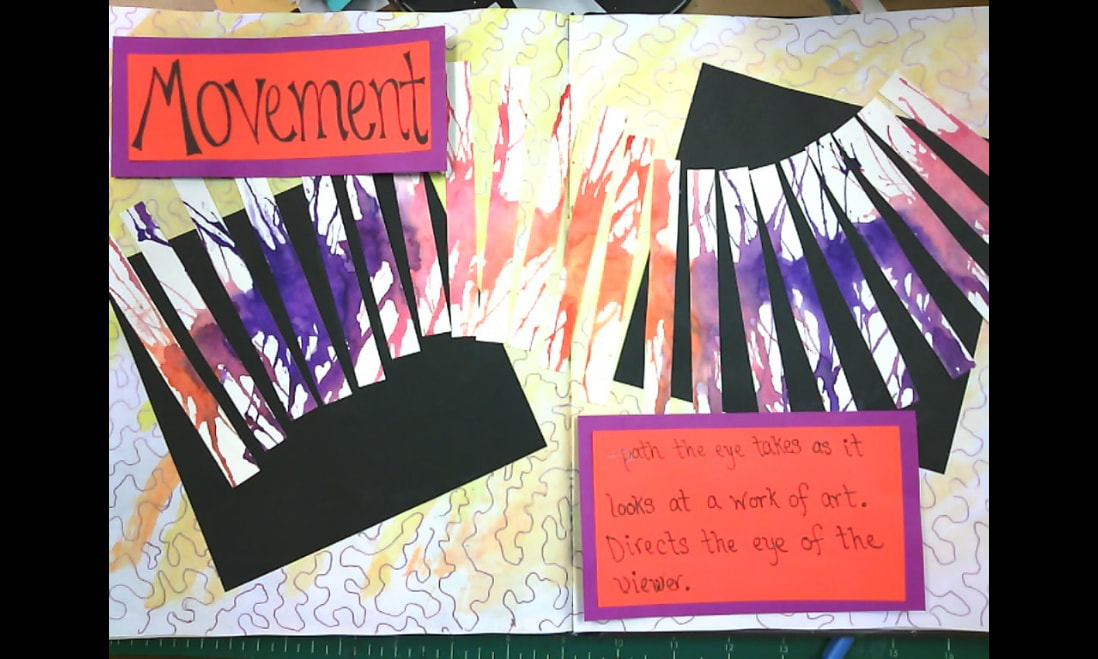
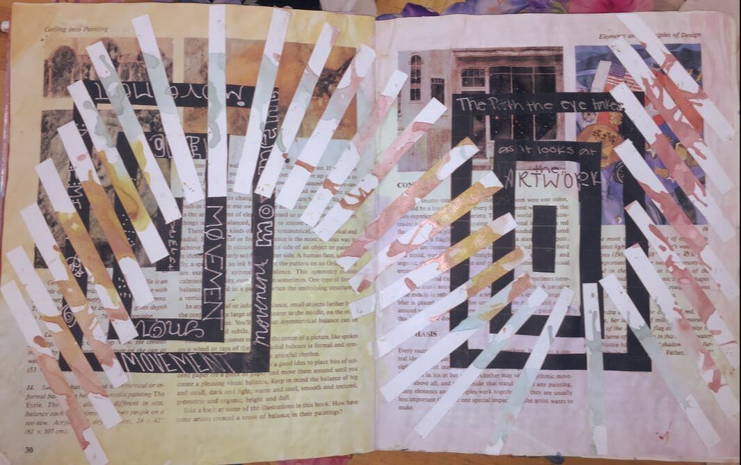
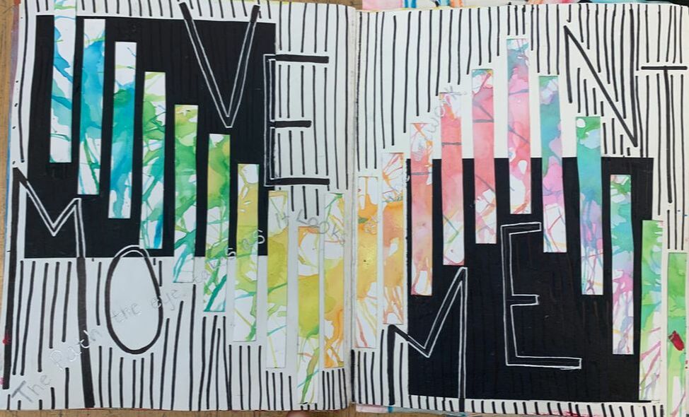
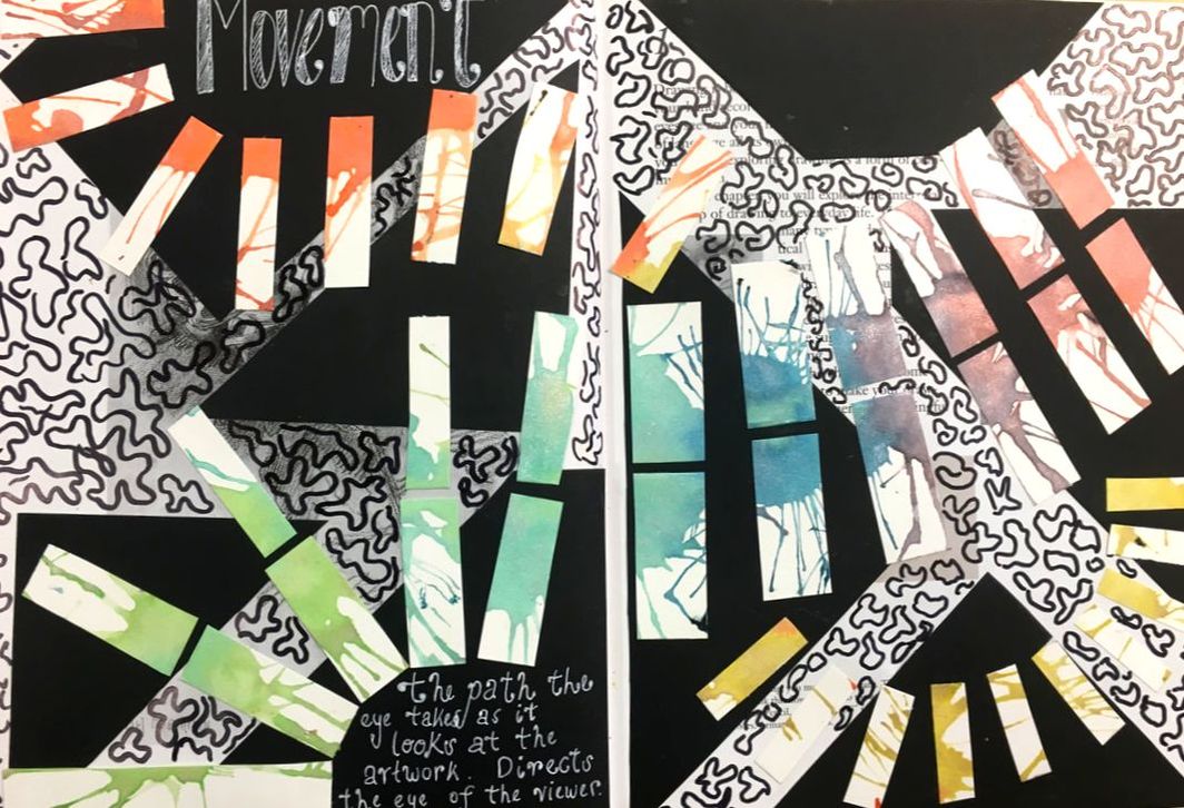
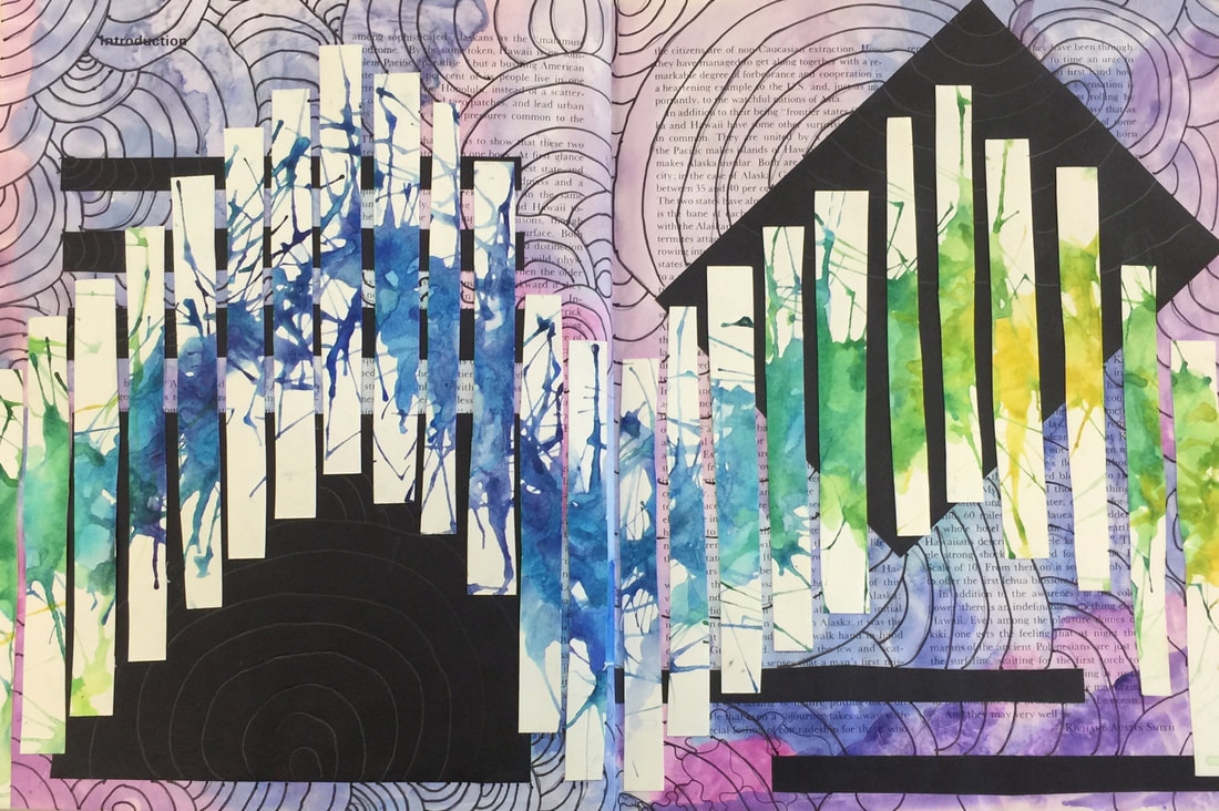
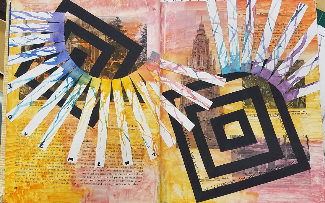
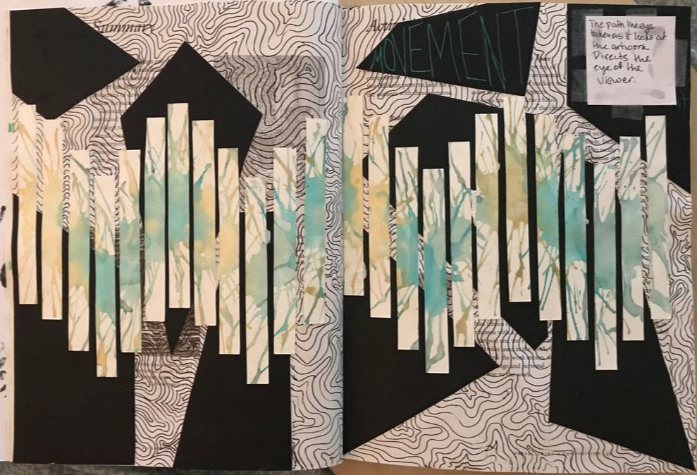
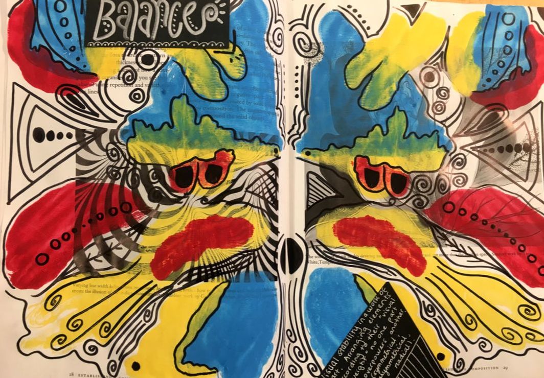
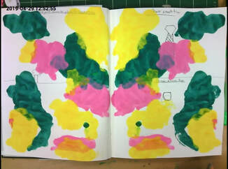
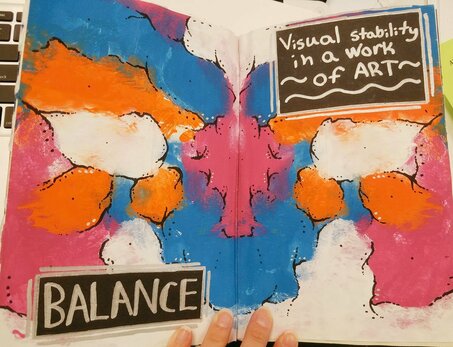
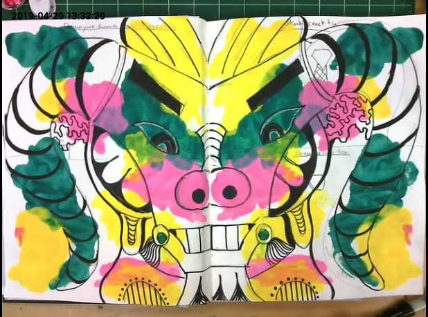
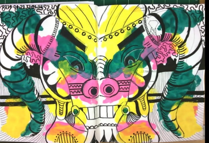
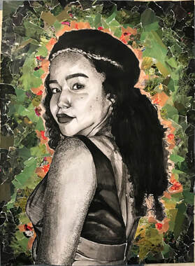
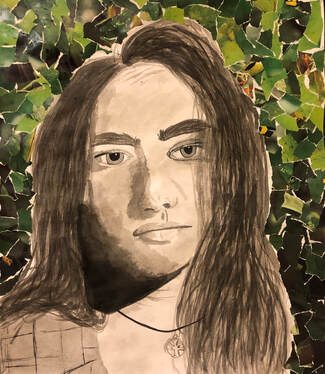
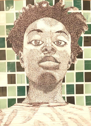
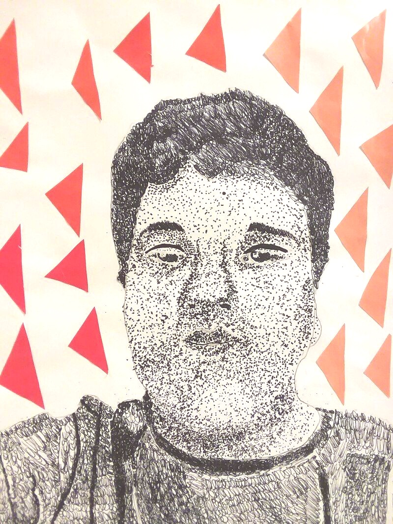
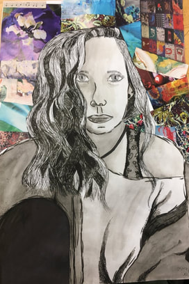
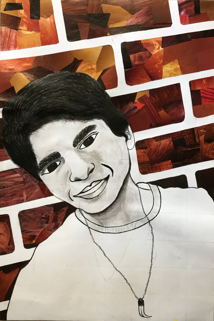
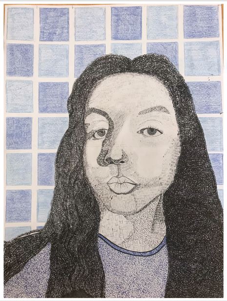
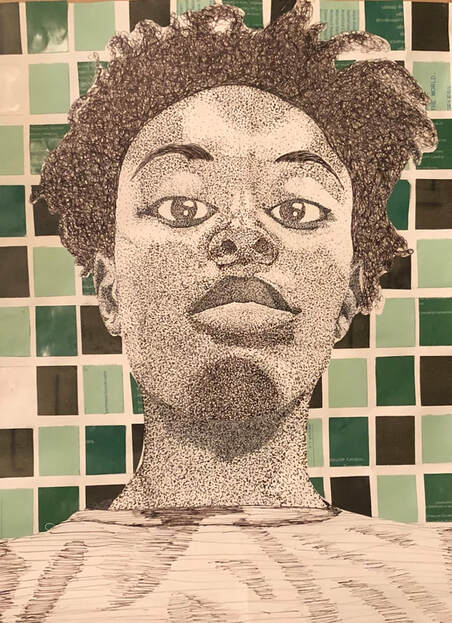
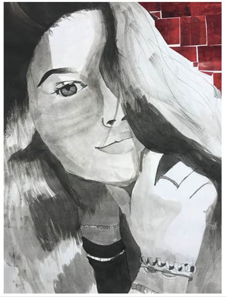
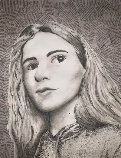
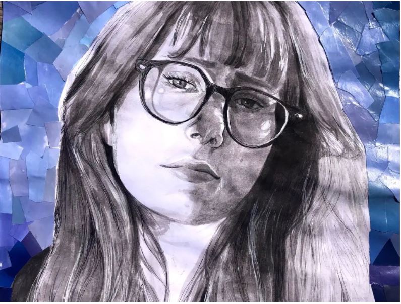
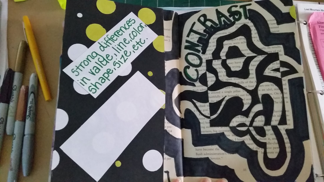
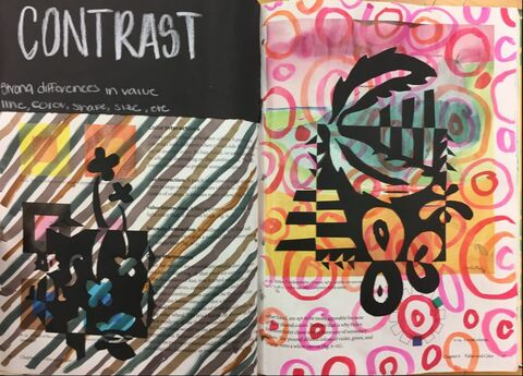
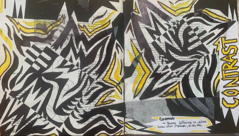
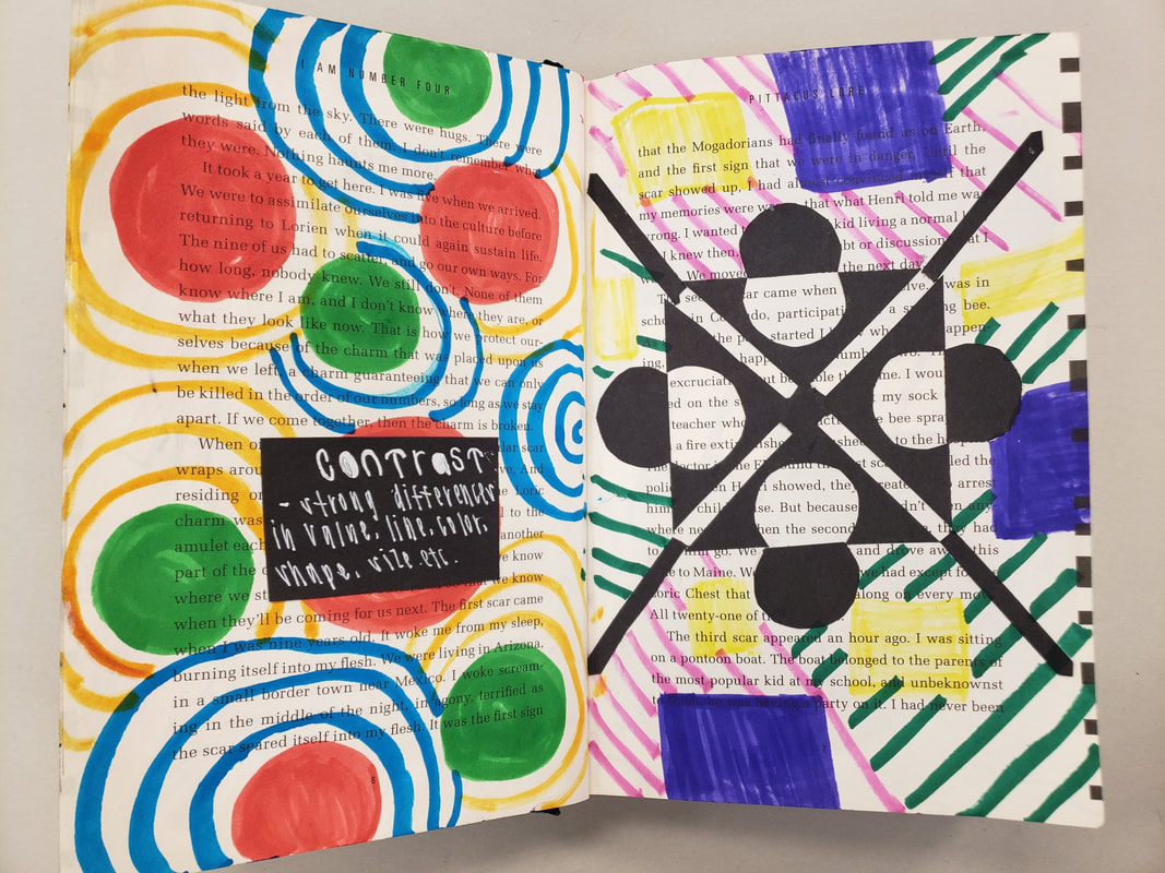
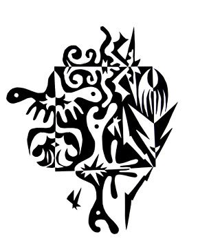
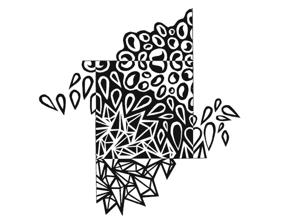
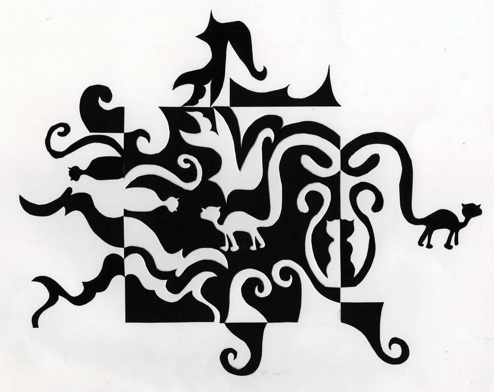
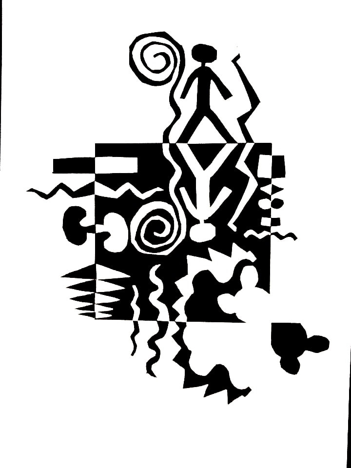
We are beginning the background for our still life drawings! Students will use visual journal techniques to make our backgrounds interesting! 
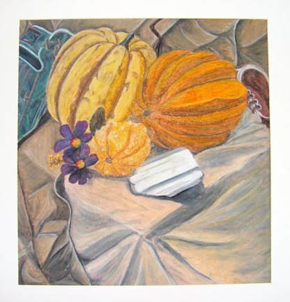
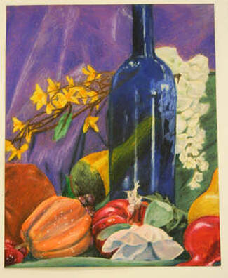
We will make our backgrounds more interesting by doing visual journaling techniques. We will then draw and/or paint our still life on top of these layered backgrounds.
The video below shows how to create step 1 for our movement page using watercolors and a straw for interesting effects!
The next steps for completing the Movement altered book page is on the video below!
Check out these samples below more more ideas:
Students will "find the creature" in the symmetrical balance design they created yesterday. They will then bring it out using colored pencil. Once it is brought out, students will add designs, the title, and definition for balance. Be sure to add the following:
Option #1: Newspaper--- use the newspaper to fill in the negative space of the background. Beware not to have too many colors, or if you do have colors, use all the same color to unify the background. Think about using the same size shape and/or negative space.
Option #2-- Colored Magazine pages:
---Use various colors to create an Ombre effect such as the ones below.
---Use various colors to create repeating shapes in the background.
---Be sure to have a PLAN and a COLOR SCHEME!!! Below are some that didn't really have a plan for the background and the backgrounds are not as strong.
Students will create a Pen and Ink self portrait. They will choose which pen and ink techniques they will use after practicing in their sketchbook pages. They will then add a background with strategic magazine or newspaper collage. Printing the imageWhen you have picked out your image, be sure to save the image to your number. (click This PC if you can't find your number)
Then, when you are ready to print, 1. open up your number 2. click on the photo you want to print. 3. click Share at the top of the window 4. click print (print to the 1401 printer. This is black and white and is better for trying to create black and white images.) To finish the Contrast Altered book, you will add at least 2 other contrasting characteristics to the book (not including the Notan Square.) Think about what CONTRAST in art really means (strong differences). This could be differences in Size, Shape, Color, Line Quality, Textures, etc.
Below are how some previous students have added CONTRAST to the rest of the pages in their altered book.
This is a great video on how to make a notan square. This we will do in our altered books!! We are going to use a Noton Square to emphasize the principle of Contrast in our altered books today!
|
Fun SitesMarilyn Maker Archives
April 2024
Categories
All
|